A California Family Collaborates with a Local Architect to Create an Impressive Beach Home
A new classic.
-
CategoryArchitecture, Design, Homes + Spaces
-
Written byZoe Alexander
-
Photographed byRoger Davies, Taryn Kent & Shane O’Donnell
Jeff and Jamie Schumacher’s home transforms the 1st Street corner it occupies with a visual impact that evokes both simplicity and sophistication. From conception, this project was fastidiously planned and purposeful in its setting.
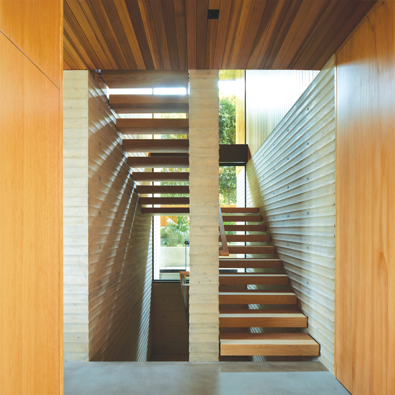
“One of our missions is to build architecture that’s timeless, hoping that it may not be torn down in 30 or even 50 years—to build something that has a sense of permanence,” says architect Anthony Laney, founding partner of Laney LA.
When the Schumachers purchased the house, Anthony still had a year of construction to go before they could move in. This allowed them to refine their wish list and partner with the team to bring the home to life. It contains many distinctive structural and technical features, in addition to buzzworthy design. A point of pride for Anthony is the way the house sits on the site. Unobtrusive, it does not “worship the view” but intrinsically utilizes the sensual delights of the landscape.

The exterior and interior of the home are composed of cedar and concrete, paired with generous windows. The four-year build, a collaboration with Silicon Bay and Dave Shaw Concrete & Block, included an intense concrete process that afforded Anthony time to obsess over the details. He notes that the scalloped concrete contains an “undulating, wave-like texture accomplished by custom milling a wood formwork.” Tall, automated doors and windows by Otiima take advantage of the breeze that circulates throughout the day.
A handsome top level, where the bedrooms are located, peeks over hedges to take in unobstructed sight lines of the Pacific. The lower level, which includes a pool and extensive outdoor living space, is surrounded by walls and hedges—deliberately landscaped for privacy and noise reduction.
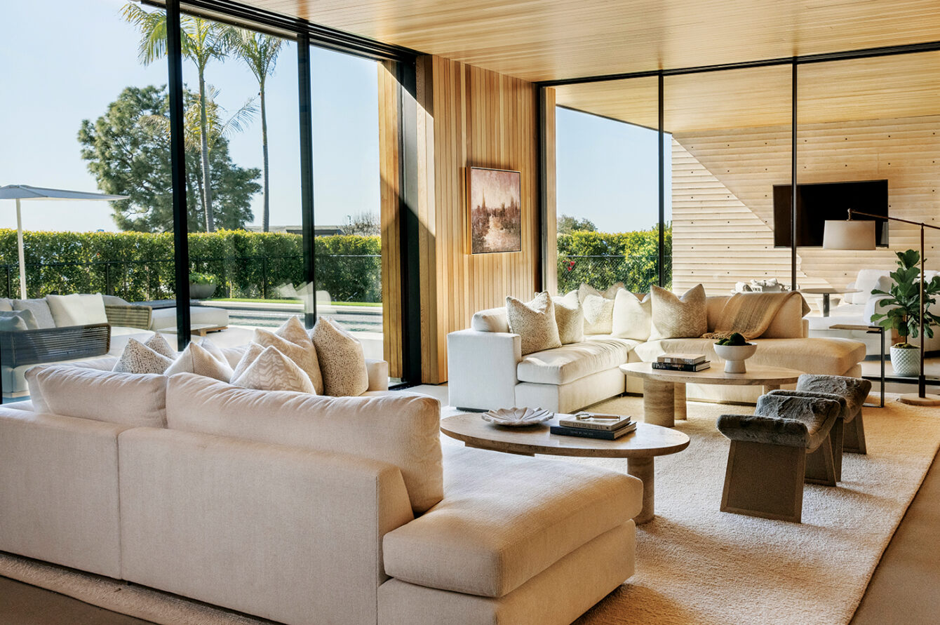
“The wood floats above in the bedroom, and the living room is anchored by these nine concrete walls which are both structural and aesthetic and add a sense of permanence and soulfulness to the house,” says Anthony.

While the home boasts many bonus features including a detached gym and elevator, it uses power as efficiently as possible. The roof sports 48 solar panels, and the home employs a heating and cooling system with 14 different zones. As Anthony explains, “By dividing the home into zones, we’re able to be far more efficient with what we need to heat and what we need to cool, rather than just pumping air less intelligently through the space.”
Jeff Schumacher appreciates many aspects of the design, especially the adaptability and flow. “It’s modular in the sense that you can keep adding things to the house as you go. If your style changes, the house will breathe into the change.”
The thoughtfulness of the layout creates cohesion in a home that could have easily become complicated and fussy. Jeff calls out the spectacular stairs—the “skeleton” of the house—that connect three levels. He notes that there are no additional stairs or landings extending from the main stairwell to the adjoining rooms, and that this enhances “the seamless movement through the house.”

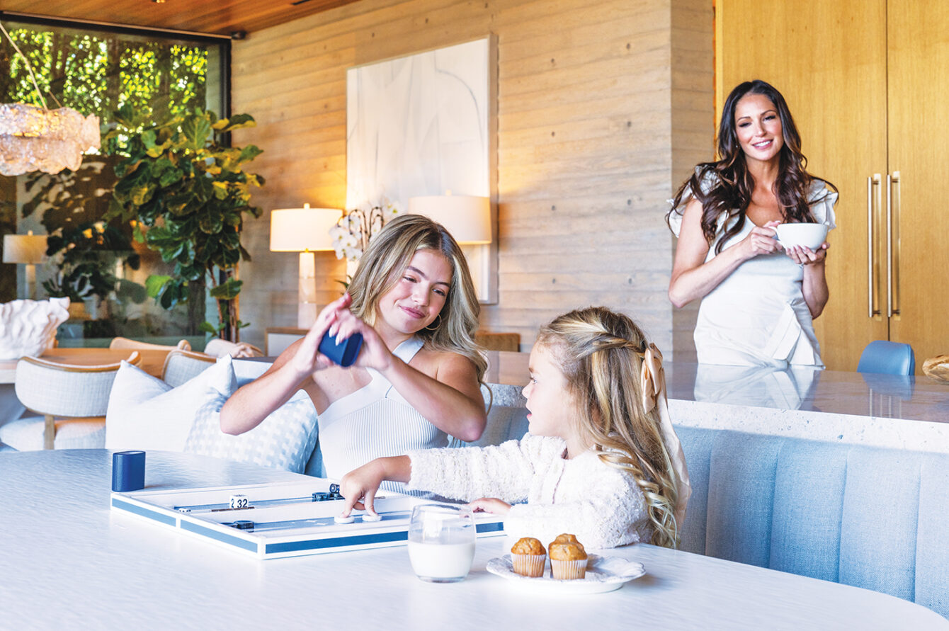
Jamie wanted to ensure that the rooms had flow and function. She knew the kitchen and first floor would be the main zone for the family to gather.
“When Anthony and I worked together to design the island, I wanted to be able to look out at my kids while they were swimming and have them close to me. There’s also a banquette where they can do homework and chat with me while I’m cooking,” she says.

Anthony was delighted. “I was really impressed with Jamie’s idea to orient the kitchen island toward the pool. That was a significant improvement I had not expected.”
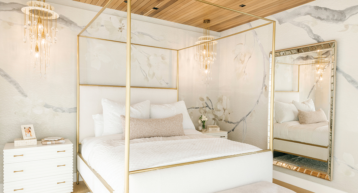
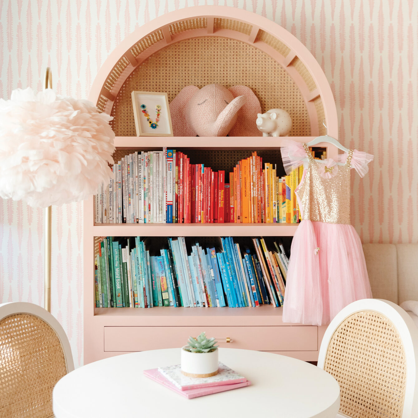
To help complete and complement the couple’s vision for the interior, Jill Johnson of Waterleaf Interiors personalized each room by leading with the family’s lifestyle. She knew the kids’ spaces would evolve over time. “I wanted their rooms to be rooms they could grow into,” she says.

Jamie adds that because the house is so modern, they sought softness with the interior design to help it feel warm and cozy to the family. Jill used a neutral color scheme, plenty of sheer fabrics and wallpaper to provide softness.
She knew that the living room, dining room and kitchen needed to function and flow together as one unified space. “I used two sectionals facing each other in this really beautiful fabric that’s also superdurable, so the kids can plop down and be cozy,” Jill says.
Understandably, everyone gushes about the many details that went into creating this new home. While it has the look of a luxurious island getaway, it is also comfortable and practical. The home achieves a timeless sensibility that nods to the future, favors form and function, and leans in to its landscape. Mission accomplished.
7 Dog-Friendly Bars and Restaurants in Southern California
Pups, patios and Pacifico.
That Holiday Bomb Cyclone Made Some Pretty Monstrous Waves Off the California Coast
We’re talking some serious swell.
The Golden Age of Hollywood is Alive and Well at These Hot Spots
Three vintage Hollywood gems worth a visit.
Get the Latest Stories


